S.M. Hospital approached BrandKob with a goal to create a visually compelling identity that would establish the hospital as a trusted healthcare provider. Their specific requirements included:
– Consistency in Design: The client needed a system that would make all designs look similar and cohesive across all materials. They wanted to ensure that everything—whether it’s the letterhead, business cards, posters, or signage—feels like it’s part of the same family.
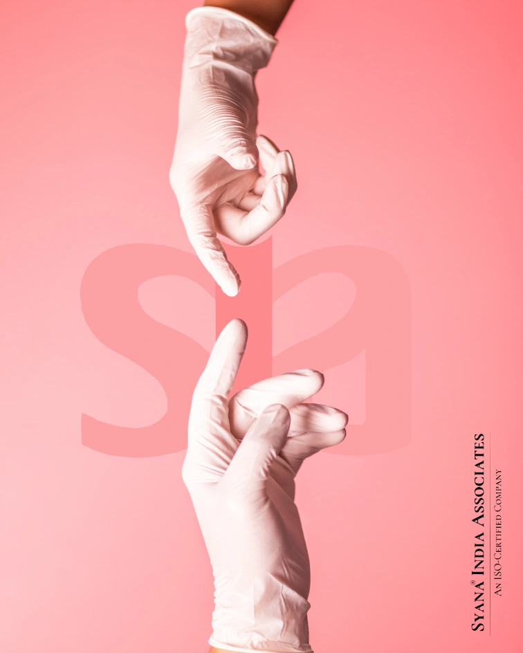
– Logo and Basic Identity: The client wanted a clean, professional logo that would represent the hospital’s trust and care. The logo needed to be simple yet strong enough to stand out in both print and digital media.
– Professional Materials: They needed essential marketing materials, such as business cards, letterheads, report bags, and posters, that would be used in the hospital and outdoors (like highway posters). All these materials needed to be consistent and professional, without looking too busy or complicated.
– Easy-to-Use Design: They didn’t want anything too complex. They just needed simple templates or designs that could be used by anyone in the future without needing to create something new every time. They wanted everything to follow the same style so it’s easy to maintain.
– Human-Centered: The client wanted to show their care for patients through images and designs. The visuals needed to feel welcoming and trustworthy, especially since the hospital deals with people’s health.