WELCOME

01.

Company Profile

Login Pharma Pvt. Ltd. is driven by a mission to enhance the health and well-being of individuals across the nation. With a portfolio of over 60 registered branded medications, their offerings span prescription and over-the-counter drugs that cater to a variety of medical conditions. They are committed to delivering innovative, safe, and effective solutions that build trust and reliability among healthcare professionals and patients alike.
Elevating Identity: A Visual Branding Revolution for Login Pharma
02.

The Brief

Login Pharma sought a transformation—not a complete overhaul but a refined, modernized visual branding identity that captured their innovative spirit. They had a foundational logo but wanted to redefine its perception. Their request, in essence, was simple yet profound:
“We want our brand to speak to our excellence, innovation, and attention to detail in every interaction—be it on packaging, product literature, or digital platforms.”

This included:

– Refining their existing logo to create a fresh yet familiar identity.
– Establishing a consistent branding guide that could serve as a blueprint for all design elements across platforms.
– Modernizing their product packaging with unique patterns and color schemes tailored to each product’s purpose.
– Designing literature for every product with clarity and professionalism, showcasing essential information like composition, usage, and implications.

The challenge wasn’t just about making things look good; it was about aligning the brand with its commitment to quality, trust, and innovation in every visual detail.
03.

The Approach

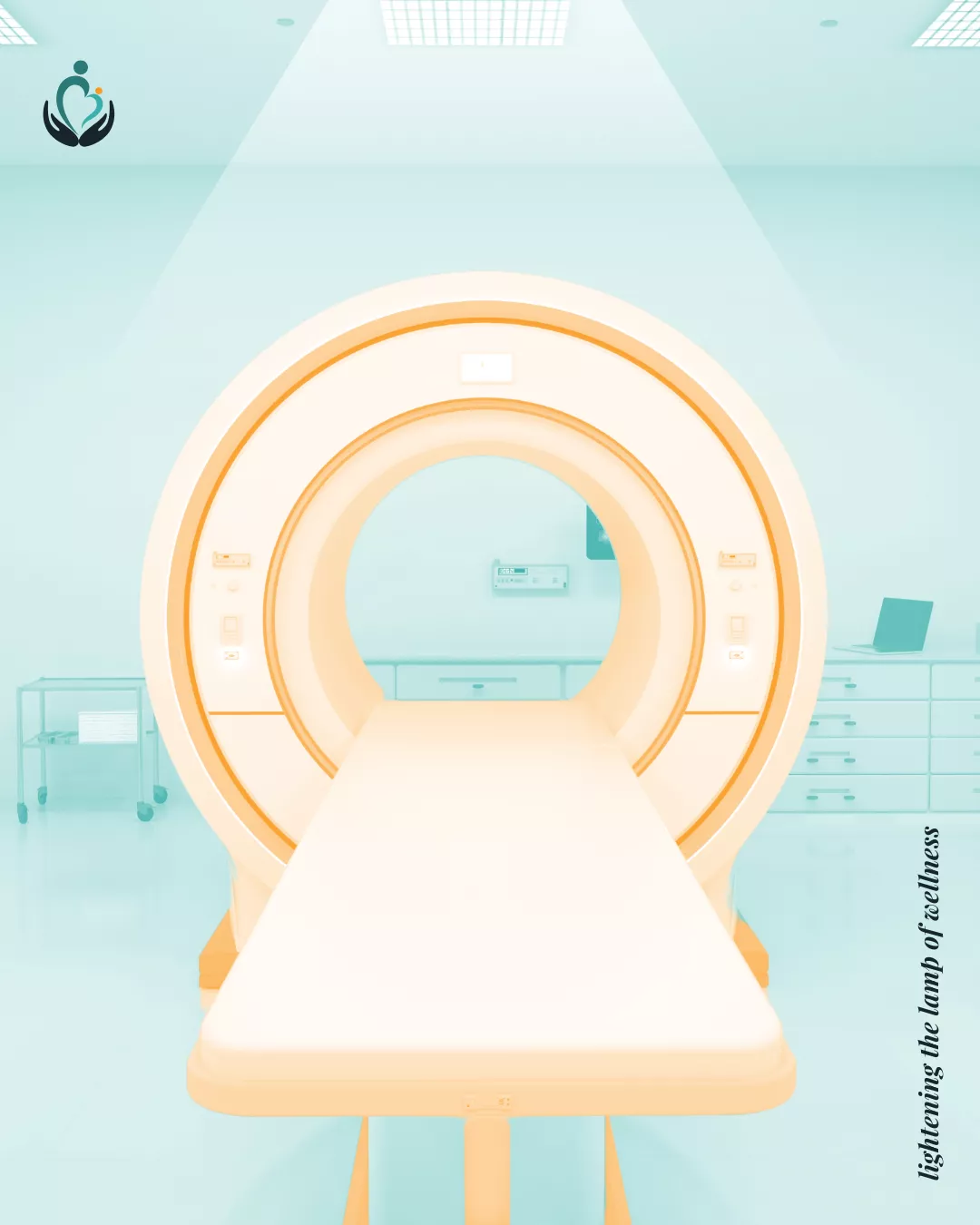
1. Logo Refinement and Typeface Evolution

We began with their existing logo, maintaining its recognizable essence while introducing a modern typeface that exuded professionalism and confidence. The refined logo set the tone for the entire branding identity, serving as a symbol of trust and innovation.

2. Developing a Comprehensive Brand Guide

To ensure consistency, we created a detailed brand guide that outlined:

  • A modern and professional color palette reflecting health and innovation.
  • Fonts and typography that communicated clarity and sophistication.
  • Guidelines for using the logo and visual elements across digital and print media.

3. Redefining Product Packaging

Each product was treated as a unique entity, with a tailored design that incorporated:

  • Purpose-driven patterns and colors matching the product’s medical use.
  • Sleek, modern layouts that made the packaging stand out while being practical and user-friendly.
  • Visual cues that created a sense of trust and uniformity across the product line.

4. Designing Product Literature

For every product, we crafted detailed literature that balanced aesthetics with essential information. This included:

  • High-resolution product images.
  • Clear and structured details on composition, usage, dosage, implications, and side effects.
  • A cohesive visual theme aligned with the product packaging.

5. Beyond Print: Expanding to Digital Platforms

We ensured that the new branding identity translated seamlessly across digital platforms, including the website and tablet presentations. The result was a cohesive brand experience that Login Pharma could confidently present to healthcare professionals, partners, and customers alike.

Keep Earning From Client - BrandKob Values
04.

The Outcome

– Logo Redefinition: Maintained familiarity while elevating the perception of the brand with a sleek typeface and refined design.
– Comprehensive Brand Guide: Provided a solid foundation for consistent branding across all touchpoints.
– Modern Packaging Redesign: Revolutionized the look and feel of 60+ products, aligning each design with its use case and building a unified visual identity.
– Detailed Product Literature: Created professional, visually engaging materials that effectively communicated critical product information.
– Digital Consistency: Extended the branding into the digital realm, ensuring a seamless experience across all platforms.
Working with BrandKob was a game-changer for us. They took our basic ideas and turned them into a cohesive, modern identity that truly reflects who we are. From the logo to the packaging, every detail was meticulously crafted. Our products now stand out not just for their quality but also for their presentation. We couldn’t have asked for a better partner in this transformation.
Mr. Dinesh Kumar
Managing Director
Share

Explore Next

Why is it that the remote is always on the farthest couch when you're the most comfortable?

But luckily not everything good has to be hard to reach. Just fill ou the form below and let’s make sure your visual identity is always within reach—clear, consistent, and unforgettable.