1. Discovering the Core Essence
We started by immersing ourselves in Zyamina’s story—understanding their values, aspirations, and target audience. It became clear that their identity needed to convey:
- Pride in their craft.
- Sophistication in their solutions.
- Trust through their professionalism.
2. Designing the Logo
With a clear understanding of their brand values, we embarked on the creative journey. The task was daunting but thrilling—this wasn’t just a logo redesign; it was a new visual identity that had to be versatile, scalable, and meaningful across multiple platforms.
We experimented with more than 200 variants of the logo, each trying different approaches. And we finally landed to the logo with Z and S they finally wanted. This updated logo was adaptable yet iconic— a perfect representation of Zyamina.
3. Crafting the Brand Guide
A clean and minimal brand guide was meticulously crafted to ensure:
- Consistency across all visual elements.
- Detailed instructions on logo usage, color schemes, and typography.
- Scalability for future designs across diverse mediums.
4. Bringing the Identity to Life
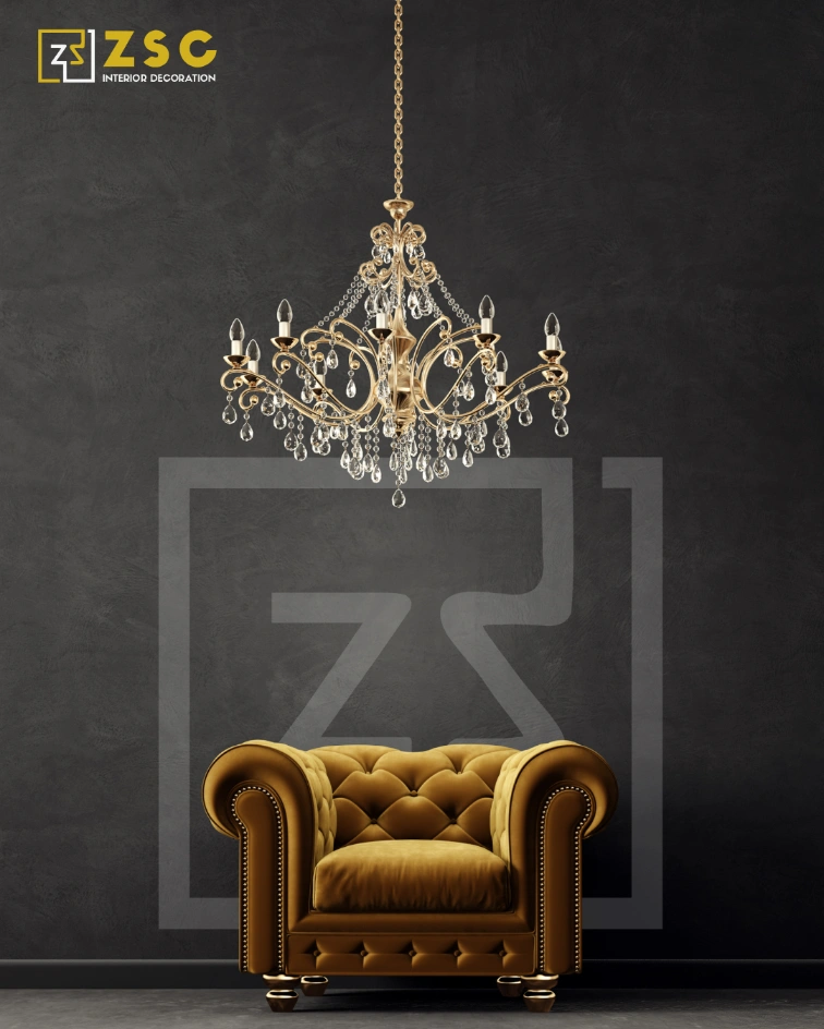
- Business Cards: A sleek design with a focus on clarity and professionalism. Gold accents on a dark base added a luxurious touch, making an unforgettable first impression.
- Letterhead: A crisp, well-balanced layout that seamlessly integrated the logo and contact details.
- Stamps: A simplified logo stamp for official documentation, exuding trust and authority.
- Mockups: Showcasing how the identity could shine on digital platforms and physical items, from office signage to merchandise.