WELCOME

01.

Company Profile

Fast N Fusion was established with the vision of blending quality and style in fashion. Catering to both men and women, the brand brings an expansive collection of trendy and comfortable clothing, including lowers, t-shirts, jeans, trousers, and shorts—all under one roof. Built on a foundation of modern aesthetics and premium quality, Fast N Fusion strives to be the go-to brand for contemporary fashion enthusiasts.
Visual Identity That Briskly Blends in Amity – Fast N Fusion
02.

The Brief

Fast N Fusion sought a comprehensive visual brand identity that could unite their business ethos with a striking and cohesive design language. Their ask:
“We want an identity that reflects our motto, stands out in the competitive fashion market, and sets the tone for our brand across all platforms.”

The challenge was to refine the typeface and composition of the logo, ensuring it became an emblem of their values while complementing their existing logo symbol. Additionally, they wanted promotional materials like posters to announce the grand openings of new franchises.

Key elements required:

– Typeface and Composition: A refined typeface and harmonious composition to align with the logo symbol and resonate with the brand ethos.
– Brand Visuals: Posters for franchise launches that captured the excitement and energy of the brand.
– Consistency: A branding system that maintained uniformity across digital and physical touchpoints, reinforcing trust and familiarity.
03.

The Approach

1. Refining the Typeface and Logo Composition

The primary focus was on creating a typeface and logo composition that communicated Fast N Fusion’s core values.

  • We selected a modern sans-serif typeface with subtle rounded edges to evoke warmth and approachability while maintaining a sleek, professional look.
  • The logo composition was meticulously balanced, placing the symbol and text in perfect harmony. The typeface’s size, spacing, and proportions were adjusted to ensure scalability and versatility across applications.
2. Establishing a Brand Language

To ensure the brand’s visual identity was cohesive, we:

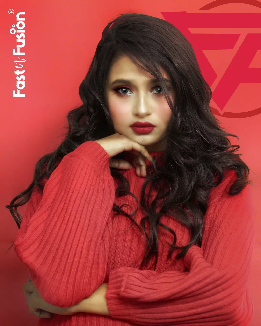
  • Developed a color palette inspired by the dynamism of fashion, featuring bold yet approachable hues like vibrant reds, deep blues, and soft neutrals.
  • Created a visual rhythm that blended contemporary design trends with timeless elegance, reflecting the company’s dual focus on style and quality.
3. Designing Franchise Posters

For franchise opening announcements, we designed visually striking posters that:

  • Featured bold typography paired with high-impact imagery of Fast N Fusion’s clothing line.
  • Incorporated the logo typeface and composition, ensuring brand consistency.
  • Emphasized the brand’s motto and launch details, blending excitement with sophistication.
4. Crafting a Comprehensive Brand Guide

We documented all elements of the visual identity in a brand guide, providing Fast N Fusion with:

  • Typeface specifications and logo usage guidelines.
  • Color codes and imagery styles for marketing materials.
  • Design principles to maintain consistency across all platforms, from packaging to promotional posters.

Keep Earning From Client - BrandKob Values
04.

The Outcome

– Harmonized Logo Composition: A refined typeface and balanced logo layout that became the cornerstone of Fast N Fusion’s brand identity.
– Modern Brand Language: A cohesive color palette and visual design system that reinforced the brand’s contemporary ethos.
– Eye-Catching Franchise Posters: Dynamic designs that blended bold typography with engaging visuals to announce franchise launches.
– Comprehensive Brand Guide: A detailed document ensuring consistent application of the brand identity across all touchpoints.
The team at BrandKob truly understood our vision and translated it into a stunning brand identity. The refined logo typeface and the vibrant posters for our franchise openings perfectly capture the essence of Fast N Fusion. We now have a visual language that speaks directly to our customers and franchise partners. Thank you for helping us build a brand we’re proud of!
Ms. Seema
Director
Share

Explore Next

Why is it that the remote is always on the farthest couch when you're the most comfortable?

But luckily not everything good has to be hard to reach. Just fill ou the form below and let’s make sure your visual identity is always within reach—clear, consistent, and unforgettable.