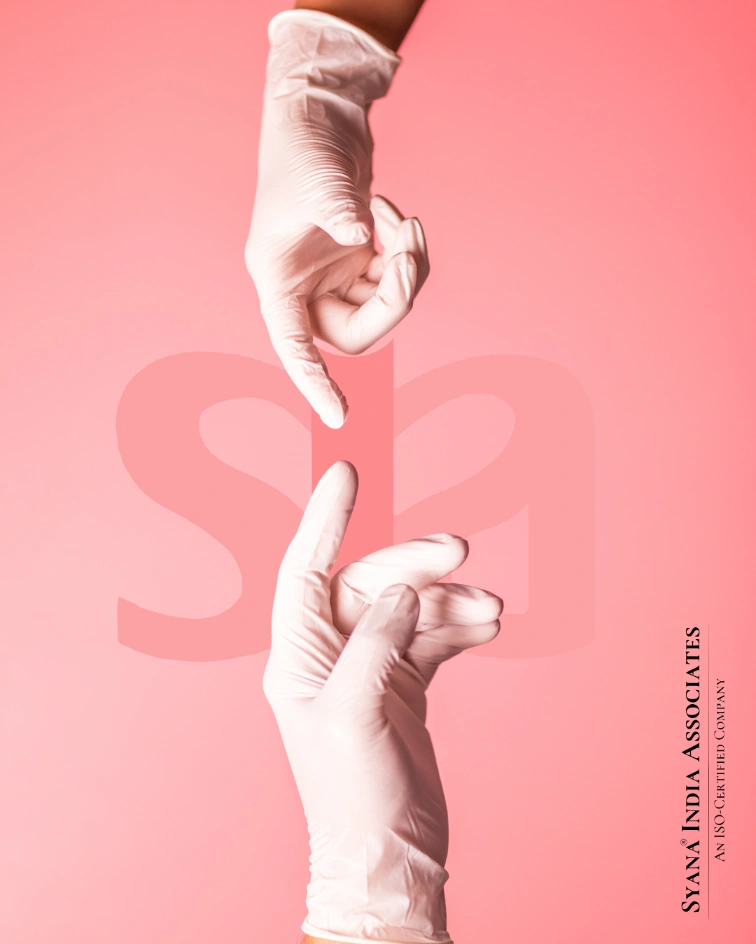
Step 1: Understanding the Heart of the Brand
Before even sketching a single logo, we began with deep immersion into AVSM’s ethos. Our team spent days brainstorming and collaborating with their leadership to understand the story behind the company. What did the ‘A’ stand for? What emotions did the Indian tricolor evoke for them? What cultural nuances should the logo reflect?
Step 2: Ideation and Exploration
With a clear understanding of their brand values, we embarked on the creative journey. The task was daunting but thrilling—this wasn’t just a logo redesign; it was a new visual identity that had to be versatile, scalable, and meaningful across multiple platforms.
We experimented with more than 200 variants of the logo, each trying different approaches:
- Bold geometric designs for a sleek, modern look.
- Flowing, organic lines to represent flexibility and adaptability.
- Subtle placements of the tricolor to ensure that the design wasn’t too overpowering yet conveyed the brand’s roots.
Step 3: Refining the Visual Language
Once the primary logo was narrowed down, we began refining the visual elements:
- Typography that spoke of professionalism yet was welcoming.
- Color palettes that balanced the vibrancy of the Indian flag with the neutrality needed for a professional service provider.
- Logo usage scenarios were outlined, ensuring the logo was applied consistently across all mediums, including websites, print, and signage.
Step 4: Finalizing the Brand Guide
To ensure the new identity was implemented correctly, we created a comprehensive brand guide. This guide covered everything from the exact color codes and typography to logo variations for different formats and use cases.